Case Study · Datanyze

From browser
lookup to full sales workflow.

Company Datanyze · ZoomInfo
My Role Product Design Lead
Scope 0 → 1 Platform · Core Features · Design System
PLATFORM
Datanyze Platform · Main list flow
Overview

B2B intelligence
that earns its place

Datanyze is a Chrome extension that gives sales reps instant access to B2B contact data while they browse. Built for small businesses and solo reps who don't have a CRM, it fills the gap between finding a contact and doing something with them. After ZoomInfo acquired it, we built the platform around it: a place to manage contacts, build lists, take notes, and run team admin. A brand new product, built inside a large company, operating like a startup.

I led design from discovery through delivery. I owned UX and UI across every core feature, drove product direction alongside the PM team, and led an animator and illustrator on the creative side. The challenge was making the platform feel like a natural continuation of the extension, not a separate product to learn.

We moved fast and made foundational decisions. Every call shaped what the product became.

Company Datanyze · ZoomInfo
Product Datanyze Web Platform
My Role Product Design Lead
Team Product Managers · Animator · Illustrator
Deliverables UX · UI · Design System · Creative Direction
Platform Web · Chrome Extension
Context & Problem

The extension captured data.
The platform had to make it useful.

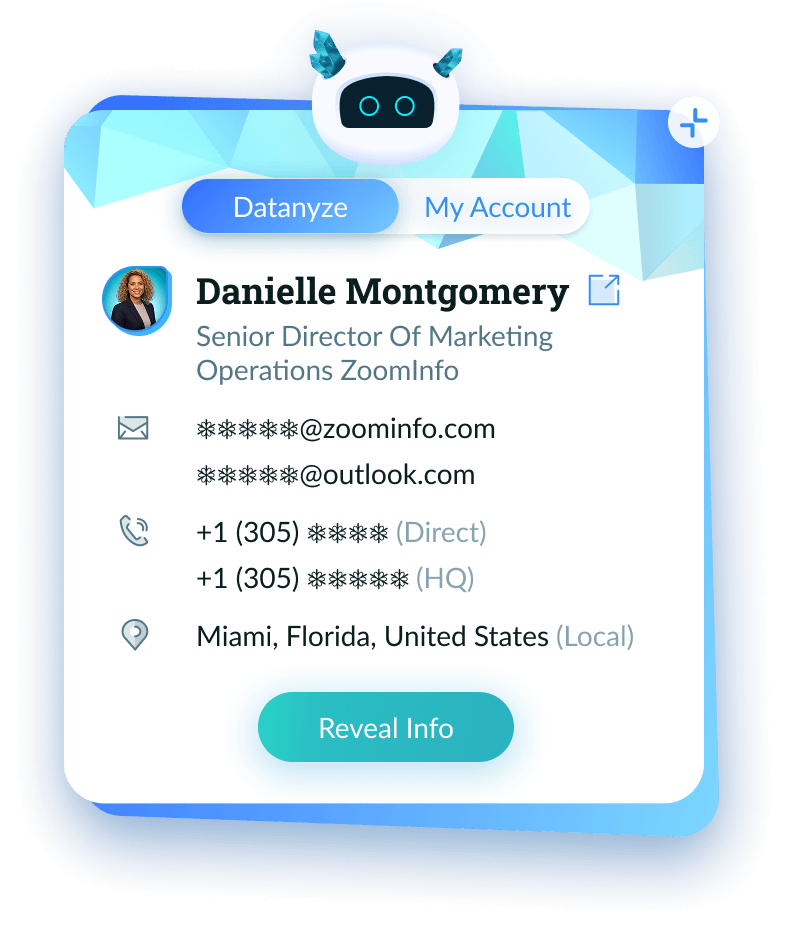
The extension was fast and focused: open LinkedIn, see phone and email in seconds. But once a user wanted to organize those contacts, share a list, or reference a note from last week, there was nowhere to go. The platform had to earn that next step, without becoming another CRM nobody wants.

Our users are solo reps and small teams on tight schedules. They needed immediate value, not setup. Every decision ran through the same filter: density opt-in, complexity out, value in seconds not sessions.
01
Feel like the same product as the extension, visually and mentally continuous.
02
Serve solo users and small teams without forcing configuration or admin overhead.
03
Get users to value in seconds. Speed mattered more than depth.
Datanyze Chrome extension showing contact card
The Datanyze Chrome extension · contact reveal in action
Core Feature · My Lists

A contact manager
that doesn't get in the way

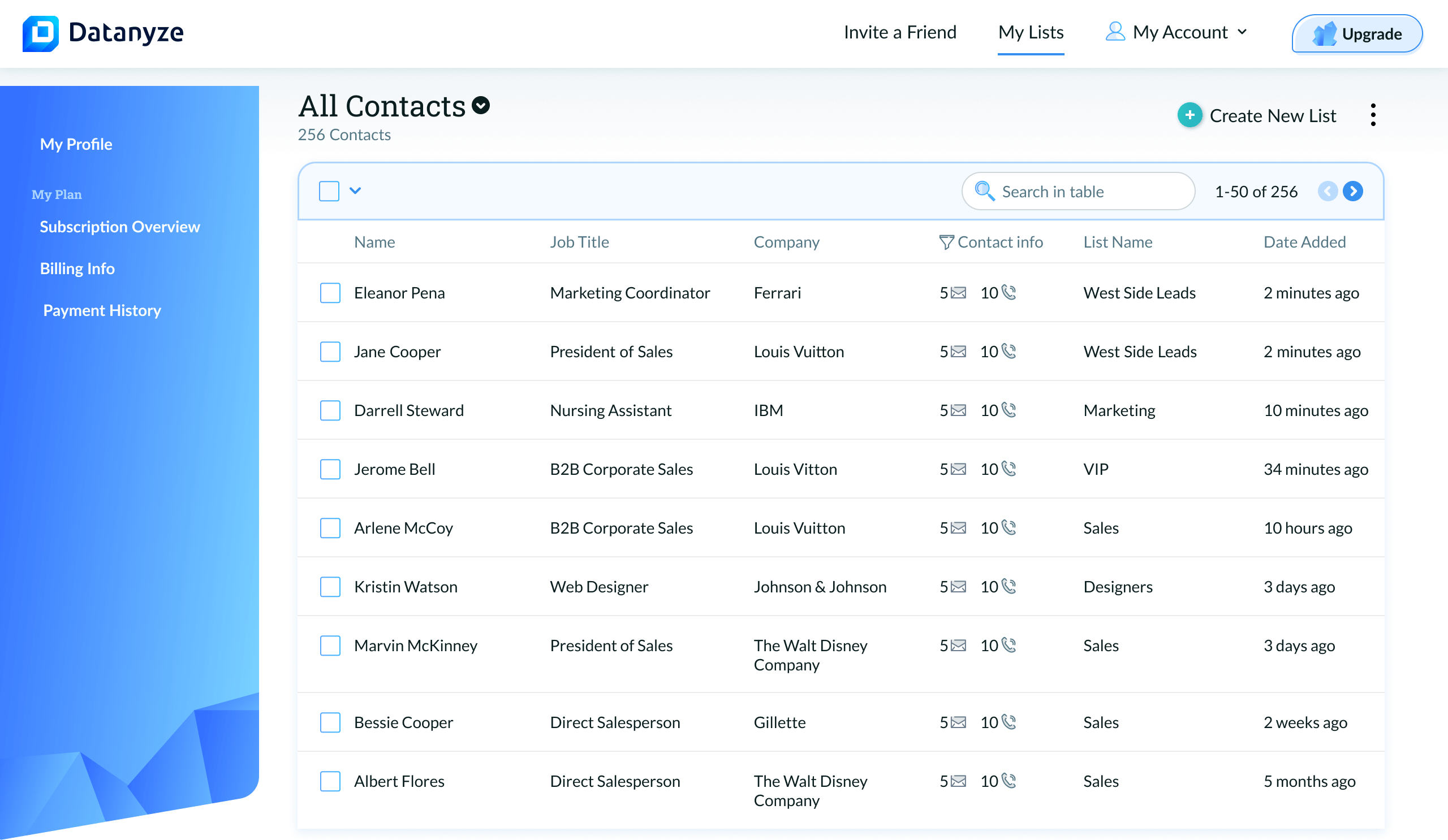
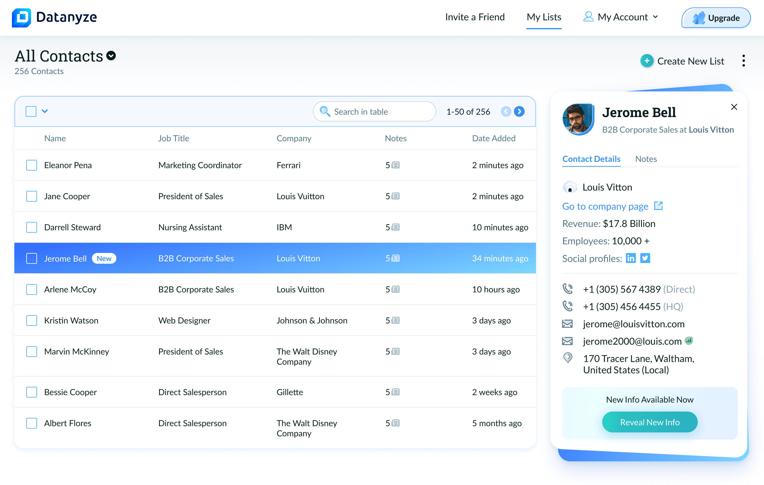
Lists became the organizing layer of the platform. Save a contact from the extension and it appears in your list. Create a focused list for a campaign and it lives alongside all your others. The design had to feel effortless at every scale, whether a rep had 12 contacts or 1,200.
01
List View
Your contacts, exactly as you organized them.

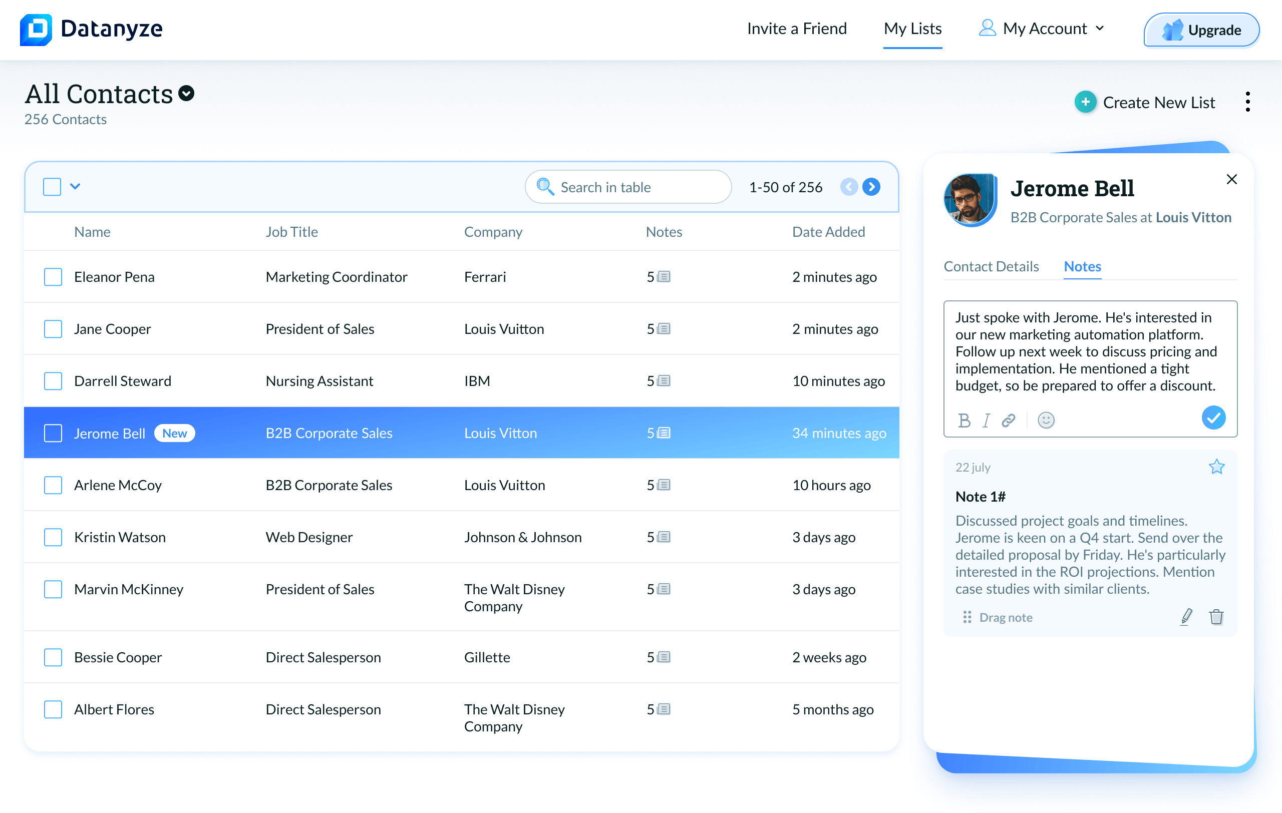
Clean, scannable table: name, title, company, note count, recency. Sort, search, and filter are always one click away but never in the way. The design prioritizes reading over editing.

Datanyze list view showing contacts table
02
Contact Details Panel
Everything you need without leaving the list.

Clicking a contact opens a side panel with phone numbers, emails, company data, and social profiles, without navigating away. Context stays intact. The "Reveal New Info" mechanic surfaces fresh data on demand, reinforcing value and driving credit engagement without cluttering the default view.

Datanyze contact details side panel
03
Notes & Context
The CRM feature nobody wants to call a CRM feature.

Notes live on every contact in the same side panel. Write, star, reorder. No overhead, no "Activity Log" framing. This is a scratch pad. Rich text formatting keeps it feeling like a writing tool, not a database field. A note that gets written is infinitely more valuable than one that doesn't.

Datanyze notes panel on a contact
04
Team Admin
Visibility and control in one place.

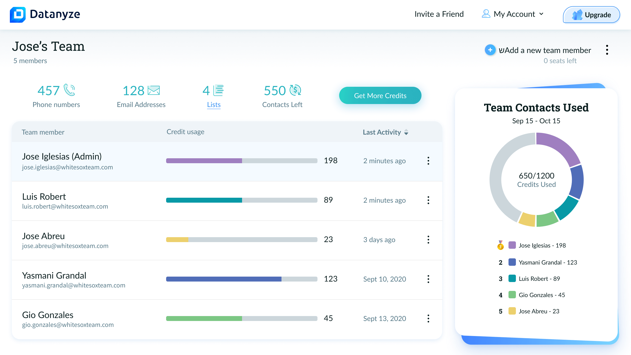
Team leads can invite members, track credit usage per person, monitor last activity, and transfer admin rights, all from a single screen.

A live donut chart breaks down credit consumption by member, turning a utility screen into a light gamification layer. Who's doing the most prospecting is visible at a glance, without a separate dashboard.

Admin view with 5 team members and credit leaderboard
Full team · Credit usage per member with ranked leaderboard
Principles · Outcomes

The decisions that shaped the product,
and what they changed

The list is the product
Everything orbits the contact list. Navigation, actions, and data stay anchored in one place.
Users move faster because they never lose context.
Panel over page
Details, notes, and actions live in a persistent side panel instead of separate views.
Work happens in one flow, not across disconnected screens.
Progressive data reveal
Not all data is shown upfront. New information is revealed on demand.
The interface stays clean while reinforcing the value of the data.
Extension continuity
The platform mirrors the extension visually and behaviorally.
Users move between surfaces without relearning the product.

The platform succeeds when the extension becomes the entry point, not the destination.