Case Study · ZoomInfo

A brand built
for the operators
of go-to-market.
CompanyZoomInfo
My RoleCreative Director
ScopeBrand System · Voice · Visual Language · Guidelines
REBRAND
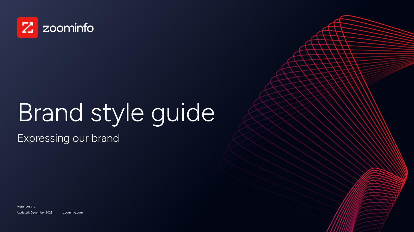
ZoomInfo Brand Style Guide cover · expressing our brand
Brand Style Guide v3.0 · Cover
Overview

A fresh take
that redefined the brand.

ZoomInfo is the go-to-market platform used by more than 35,000 companies to find, engage, and grow their customers. It sits at the center of how revenue teams actually work: the data, the signals, the workflows that move a deal from prospect to close.

I led the rebrand end-to-end: positioning, voice, identity, visual system, and the full guidelines used by every team that touches the brand. The work was about closing the gap between what ZoomInfo had become and how it presented itself: a platform built for people who run go-to-market, not people who talk about it.

The output is Brand Style Guide v3.0, a single source of truth covering voice and tone, logo system, color, typography, design elements, product illustration, photography, and accessibility standards. Deployed across web, product UI, sales enablement, deck templates, event collateral, and paid media.

CompanyZoomInfo
ProjectBrand System v3.0
My RoleCreative Director
TeamBrand · Creative · Web · Product Design
DeliverablesVoice · Identity · System · Guidelines
SurfacesWeb · Product · Sales · Events
Pillar 01 · Color

A palette
built for contrast and confidence.

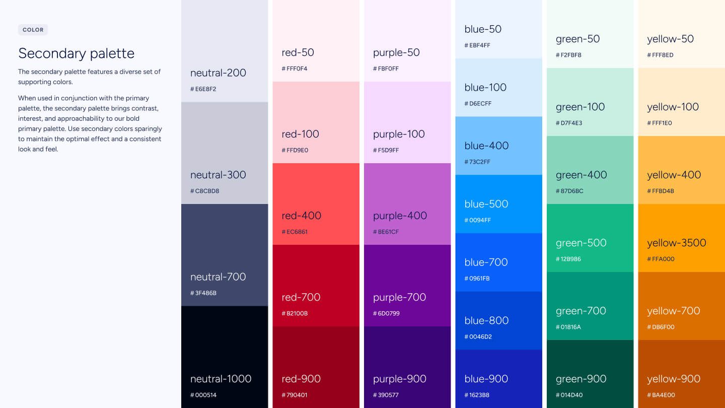
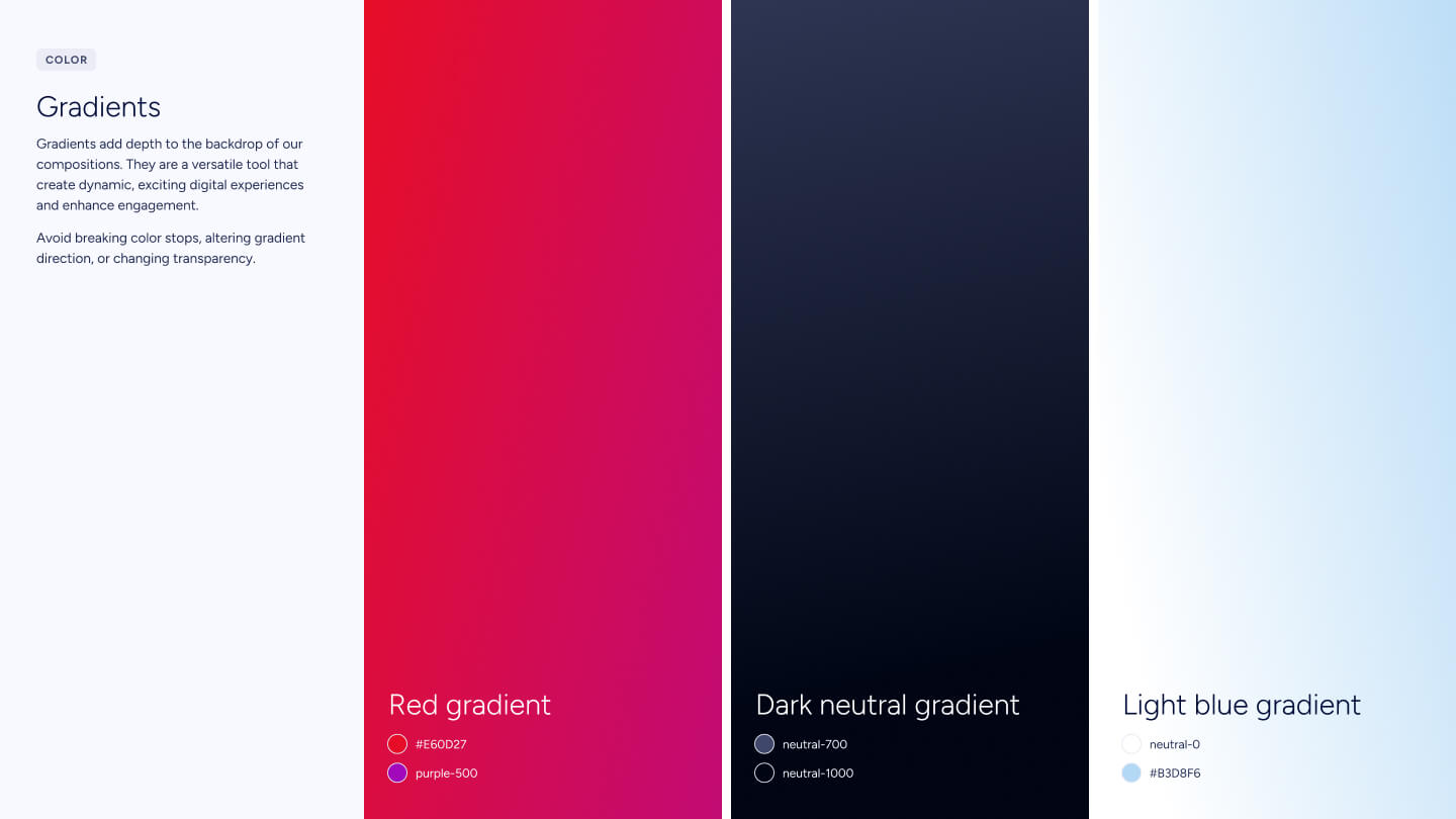
ZoomInfo Red anchors the brand. A deep neutral provides a confident dark mode foundation. Secondary purples, blues, greens, and yellows extend into product, data viz, and category systems, every value named, scaled, and accessibility-checked. Light and dark are first-class.
Primary palette · ZoomInfo Red, neutral scale, white
Primary palette · Red, neutral, white
Secondary palette with numeric scales
Secondary palette · 50–900 numeric scales
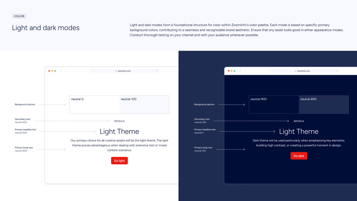
Light and dark theme examples
Light & dark themes · same brand, two complete modes
Pillar 02 · Visual Language

Movement.
Geometry. Story.

Beyond logo, color, and type, the brand needed a visual signature you could feel from across the room. Two systems carry that load: a set of animated geometric design elements that read as "go-to-market is inherently about movement," and a product illustration system that shows the actual interface doing real work, not abstract metaphor.
01
Design Elements
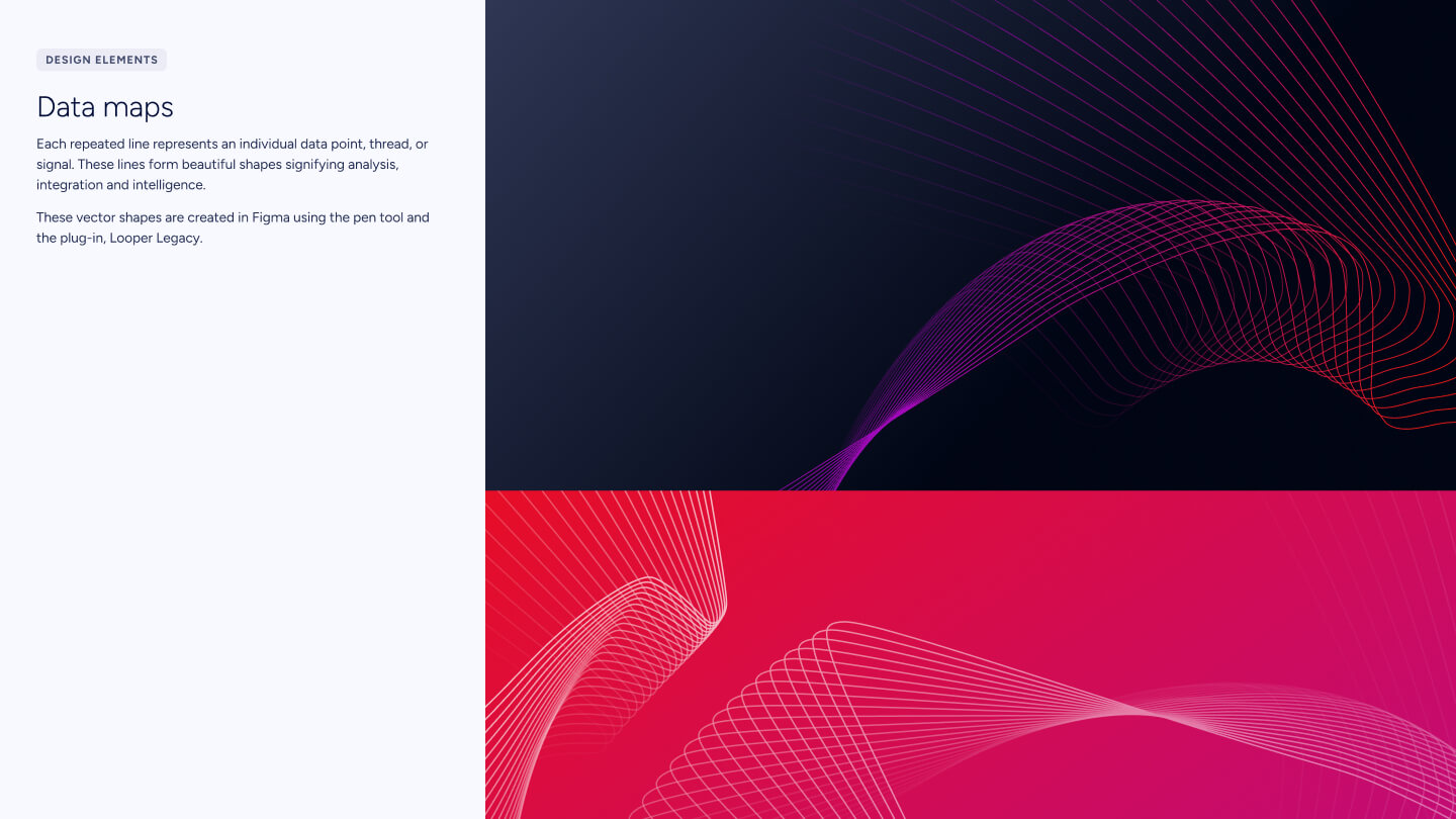
Go-to-market is inherently about movement.

The signature swooshes, line systems, and data-shape gradients are the brand's visual voice. They don't decorate, they imply forward motion, speed, and energy. The guideline defines best practices, button styling, motion grammar, and application examples so the elements stay distinctive instead of becoming wallpaper.

Design elements · go-to-market is inherently about movement
02
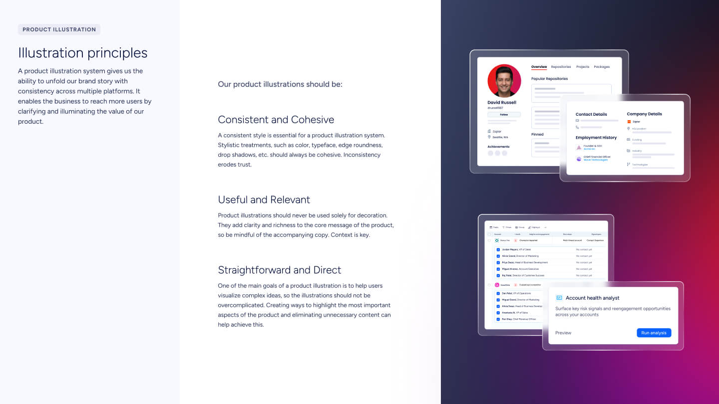
Product Illustration
Show the product doing the work.

Product illustrations introduce the product simply and authentically. They're a visual representation of the actual UI, not abstract decoration. Three principles govern every one: consistent and cohesive, useful and relevant, straightforward and direct. They support the message; they don't replace it.

Product illustration principles and examples
03
Photography
Real people. Real work.

Photography shows how our mission impacts real people, helping our audience feel collaborative, empowered, and successful. The system specifies use rich colors, prioritize diversity, choose business-smart shots, and align crops with brand palette. Misuse cases (overly posed shots, black-and-white, edited-in vibes) are called out by name.

Photography in placement · campaign and product moments
Pillar 03 · The system in market

Decks. Socials. Banners.
One system, many surfaces.

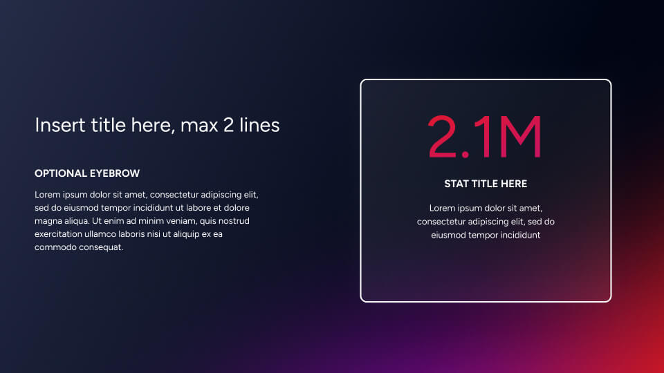
A brand only matters when teams ship with it. Deck templates, social cards, sales enablement, event banners, and trade-show collateral all pull from the same color, type, and design-element rules. Below, a sampling of work that shipped using the new system across product marketing, sales enablement, and demand generation.
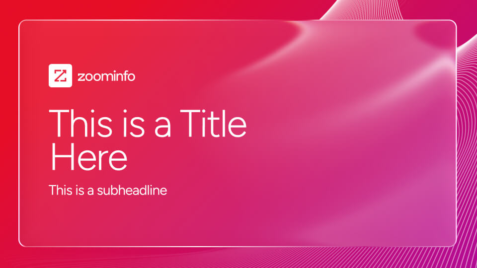
Deck template, deck cover with red data gradient
Deck cover · Red data
Deck template, interior page with dark stat
Deck interior · Dark stat
AI Readiness social card
Social card · AI Readiness
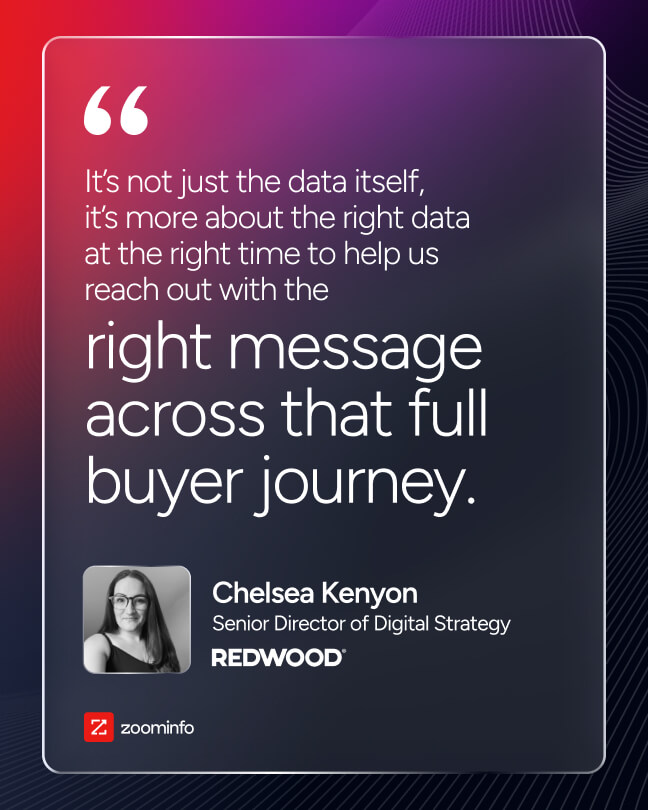
Chelsea Kenyon quote card, social asset
Social card · Quote
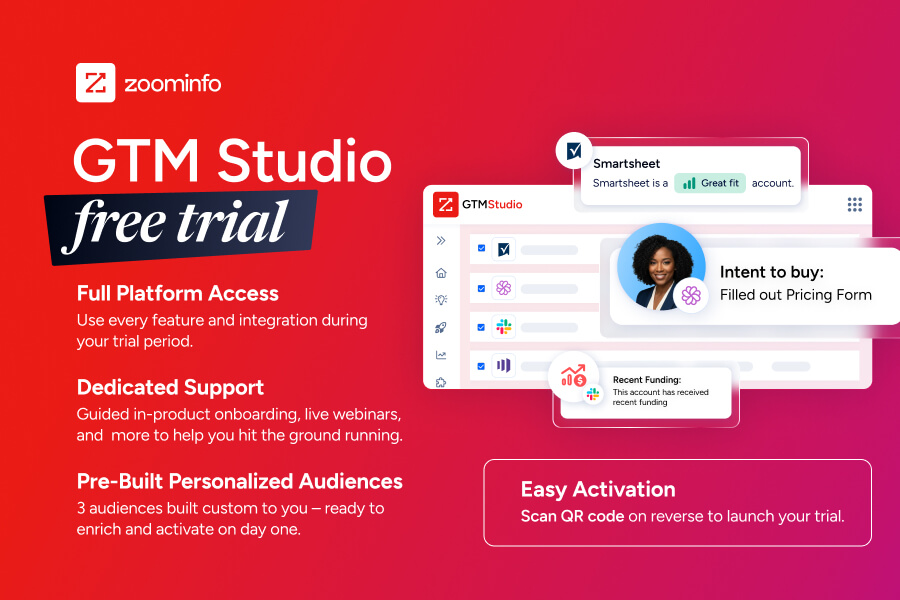
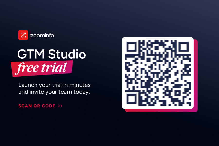
GTM Studio Free Trial event collateral, frontGTM Studio Free Trial event collateral, back with QR code
Event collateral · GTM Studio (front & back)
Pillar 04 · Web

The brand,
shipped to the website.

The clearest proof a brand actually shipped is the live website. The new color, type, motion grammar, and product-illustration rules all run end-to-end across zoominfo.com. Two views of the GTM Workspace product page below: the hero and intro stack, then the deeper-page sections showing how product illustration carries the proof.
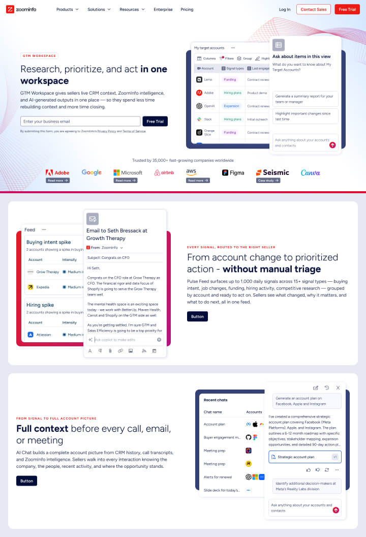
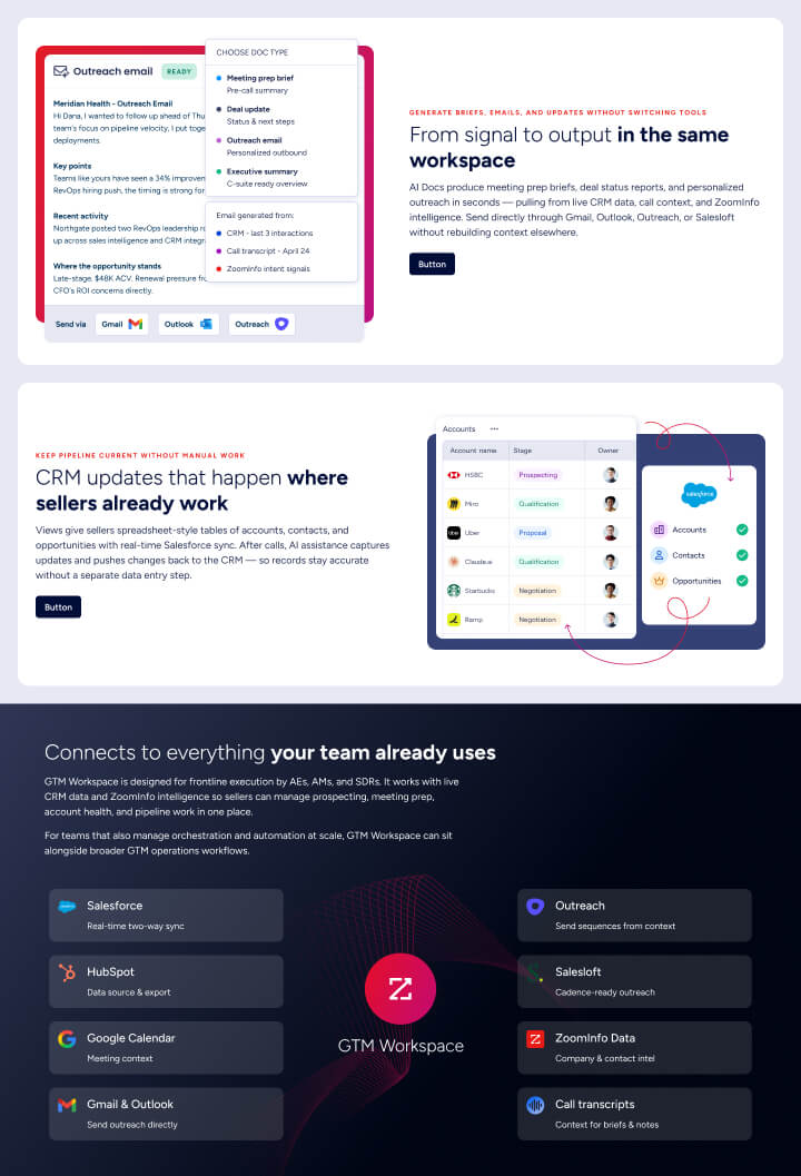
ZoomInfo GTM Workspace web page, hero and intro sections
GTM Workspace · Hero & intro
ZoomInfo GTM Workspace web page, lower sections with product illustration
GTM Workspace · Connects to everything
Principles · Outcomes

The decisions that shaped the brand,
and what they changed.

Voice first
Voice was rewritten before a single visual was made. It set the rule the rest of the system answered to.
Copy got shorter and sharper across product, sales, and marketing in the same week.
One system, every surface
Web, product, sales decks, banners, and event collateral share one source of truth instead of one folder per team.
Designers stop forking templates; brand consistency stops being a meeting.
Tokens over swatches
Every color is a named, scaled token with light/dark values. Designers pick by intent, not by eye.
Dark mode shipped without a redesign. Accessibility came for free.
Usable on a Tuesday
Every rule is paired with a worked example, a do/don't, or both. The guideline answers questions instead of stating principles.
Adoption was immediate. No second deck, no internal training tour.

The brand is the operating system for everything the company says, ships, and shows up as. Get the OS right and every team moves faster on its own.