PACKAGE DETAILS
Page Redesign
OVERVIEW
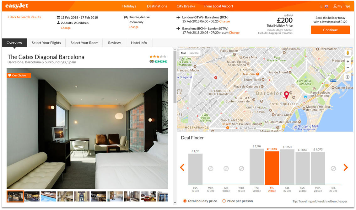
We cretead the details page for easyJet packages websites based on the design we had for our hotel-only website.
At first we left the layout of the page as it was for hotels only and added flight elements. Later on we added an informational strip on top of the page but the design didn’t seem natural and the overall design of the page was too crowded.
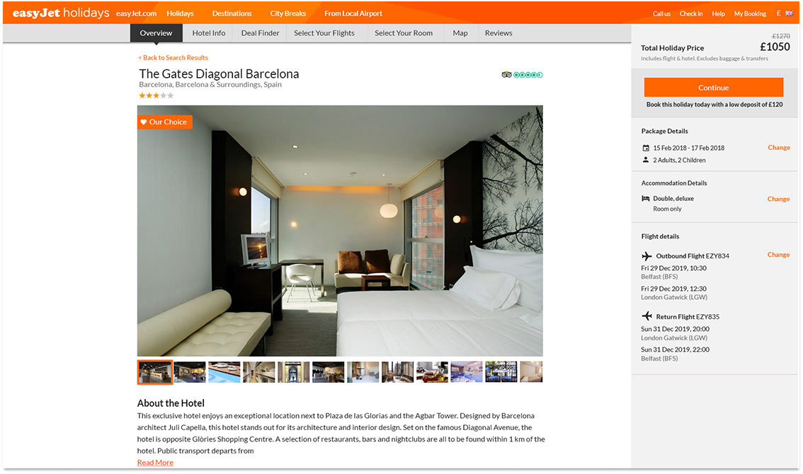
ABOVE THE FOLD
We decided to change the layout from full screen to a centered layout with a “sticky” basket on the right side with information about the package and anchor links to sections in the page.
Slide to see “Before and After”
A comparison to show the redesign of the top part of the page
FLIGHT DETAILS
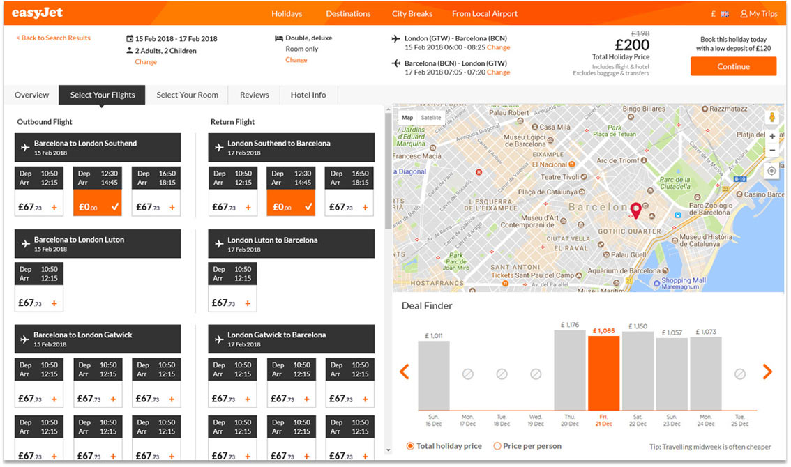
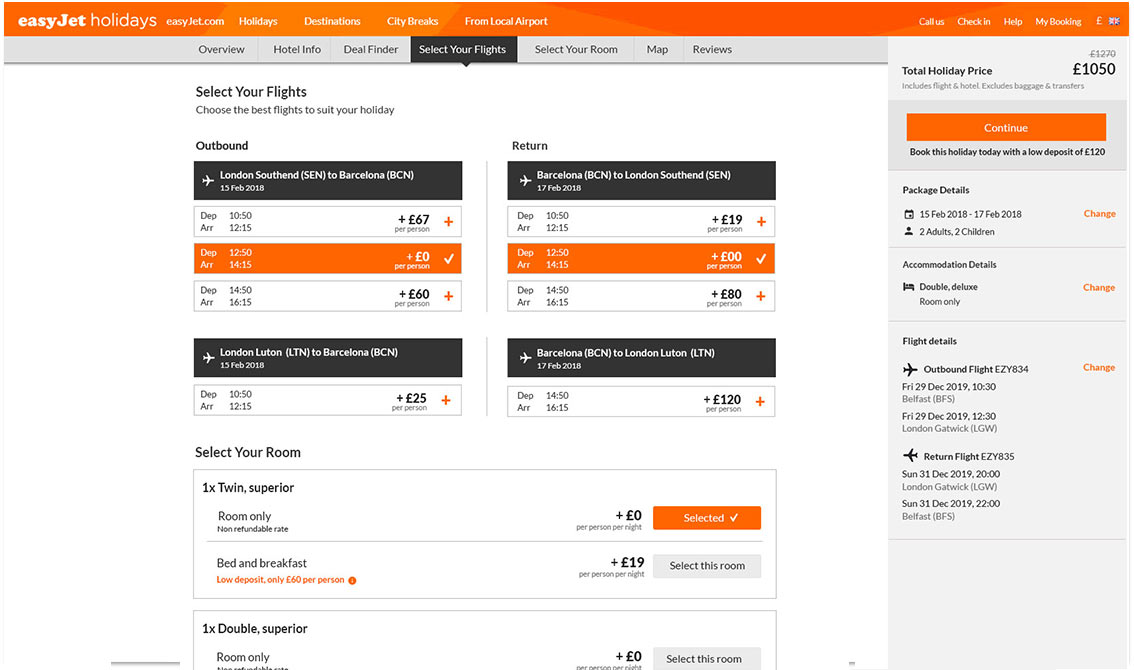
On the first design for the flights we took the layout from the easyJet flights website. I felt the layout was too complicated. There were two columns with a list going from top to bottom and subsections from left to right. I changed the layout to a list, only going from top to bottom.
Slide to see “Before and After”
A comparison to show the redesign of the flight details
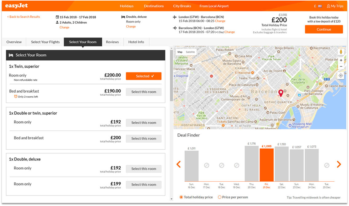
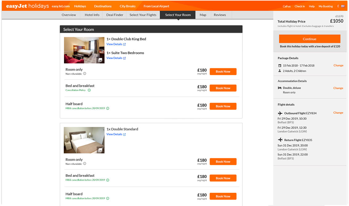
ROOM SELECTION
The redesign of this section required adding features and not only changing the layout. We added room descriptions and photos. Overall this and other sections were easier to understand for the user once the whole page had a cleaner layout.
Slide to see “Before and After”
A comparison to show the redesign of the room selection section
Contact
dafnasu@gmail.com +972 054 2163228
