TRAVEL WEBSITE
Relaunch + Redesign
Overview
Last Minute Travel was founded in 1996 and serves as a B2C & B2B2C travel white label platform for many international brands such as Last Minute Travel, Westjet, Jetstar, etc.
In 2016 I was given the opportunity to lead and design the relaunch of the site. Before starting the design, we conducted UX research that included user interviews, creation of personas and journey maps, scenarios and storyboards. Then I created wireframes and prototypes. We conducted user tests within the comapany and with users especially in the American market.
We worked on the homepage, landing pages and hotel booking flow. The new site had better SEO implementation, better UI, UX and was (finally) responsive! This resulted in an impressive raise in the conversion rates.
My Role
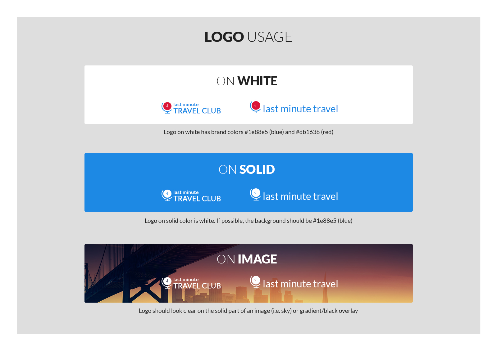
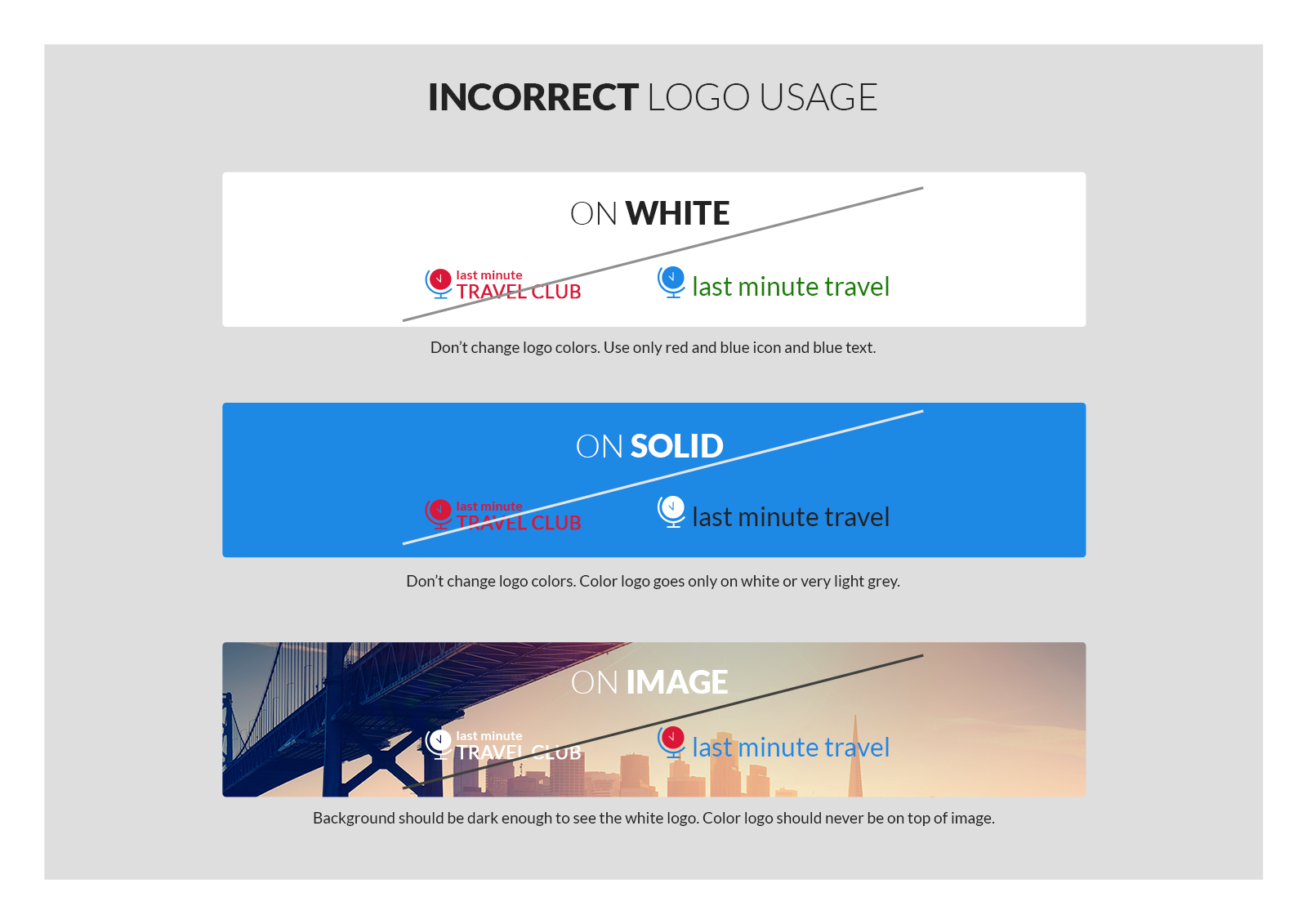
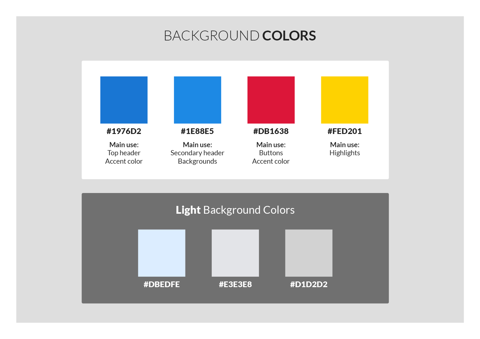
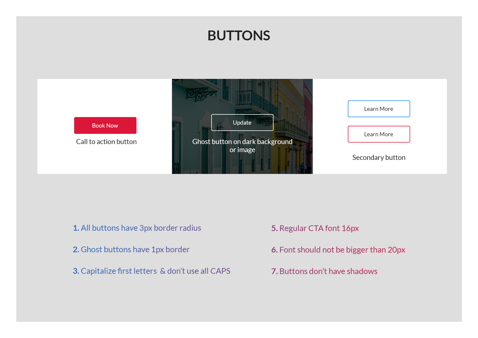
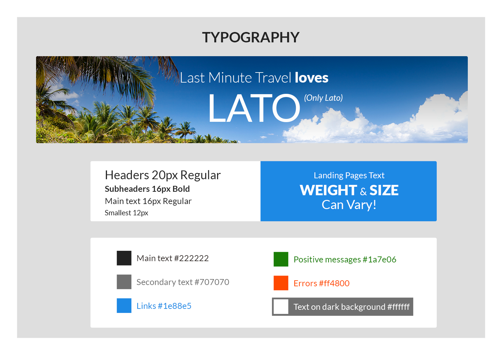
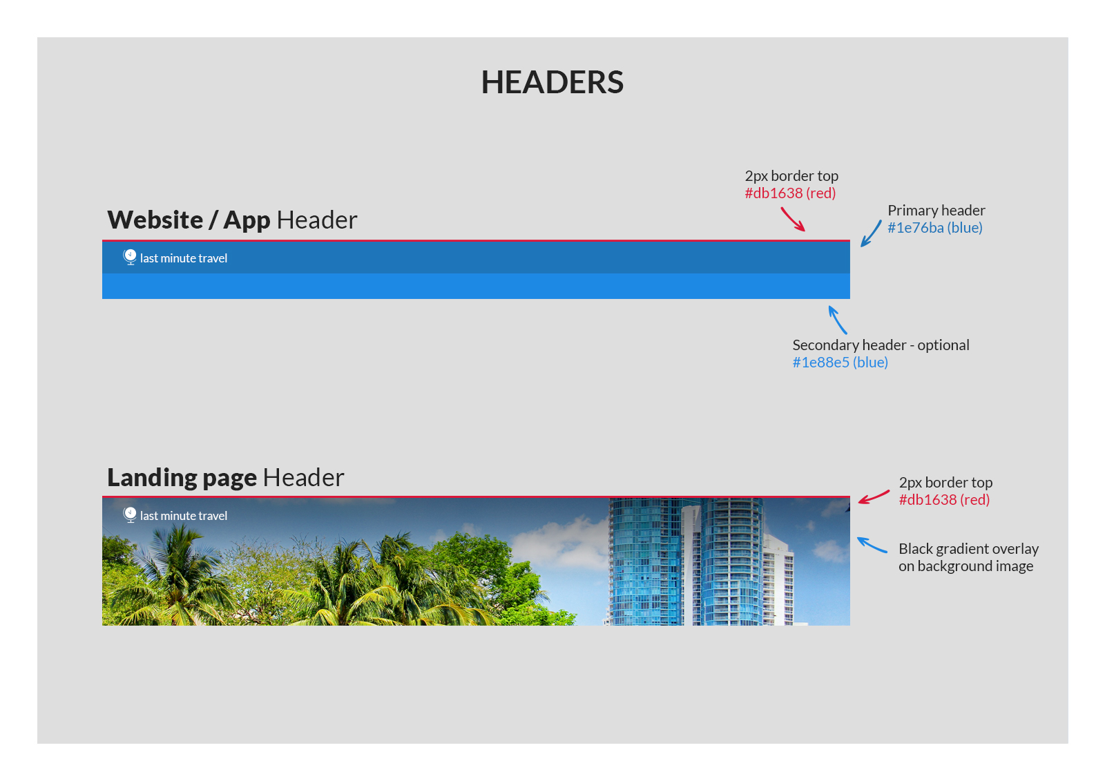
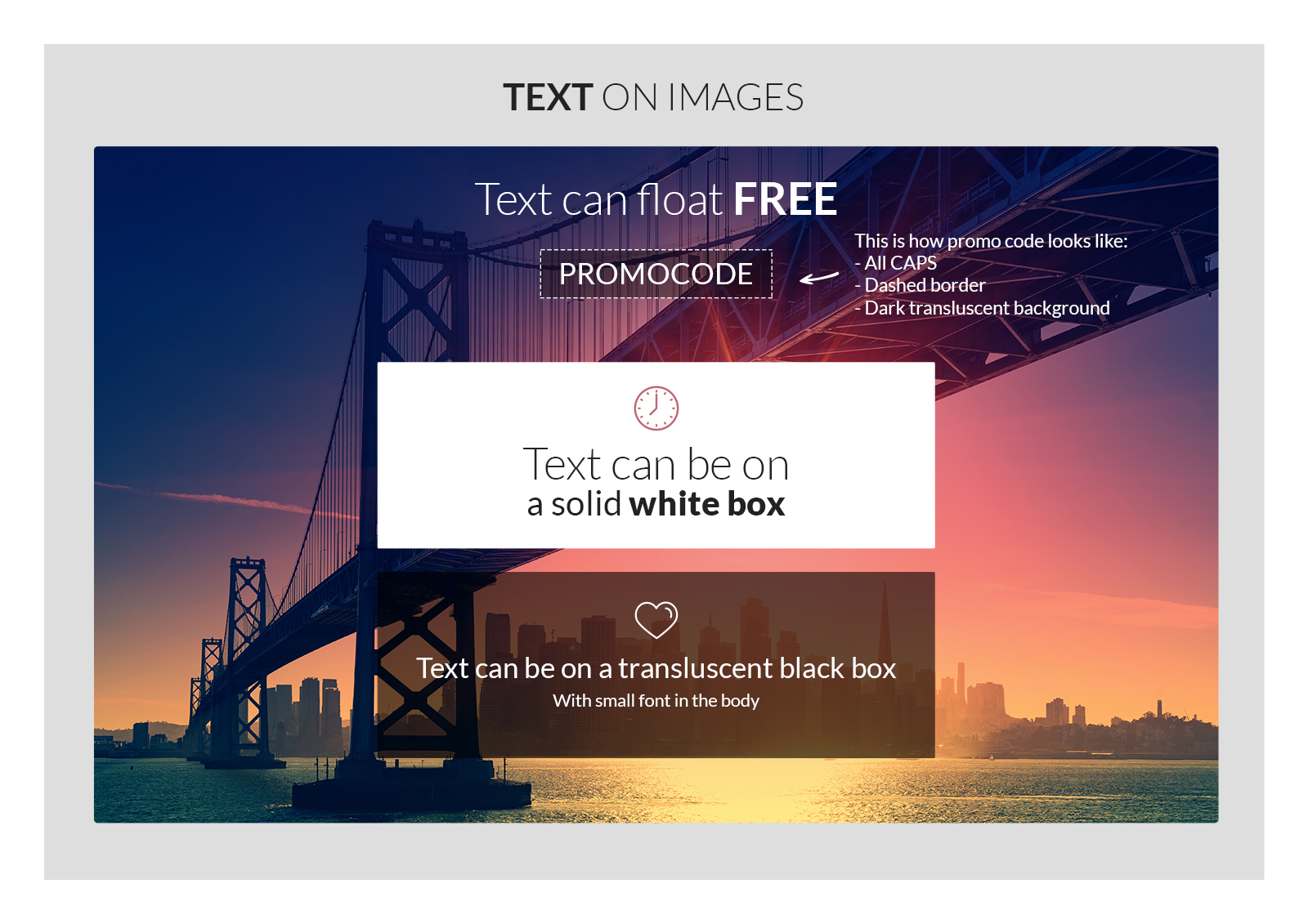
- Brand Identity: new logo and colour scheme
- User interviews
- Personas and user journey maps
- Scenarios and storyboards
- Wireframes and prototypes for user testing
- Visual and interaction design
- SEO, Analytics & AB testing
- Pixel perfect results
- Landing pages & email marketing design
UX Research
For the user research we sent a survey to users of the old website. We also conducted 5 interviews with people around us about their last travel experience, specifically when booking an hotel. For every interview we filled a user journey map in order to define the pains of the user in every stage of the booking flow. Then we created personas, we found from analytics of the old site that the most common user is female aged 30-40 traveling with kids. So we built user stories and a storyboard based on that persona.
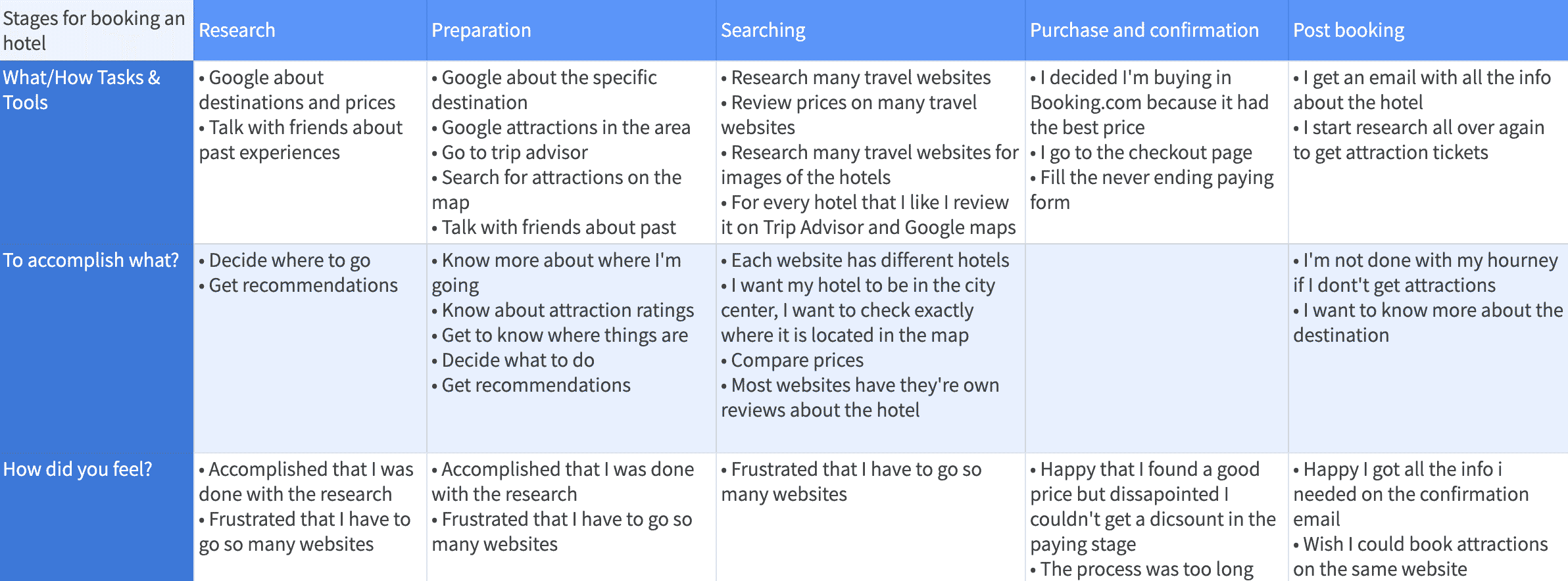
User Journey Map
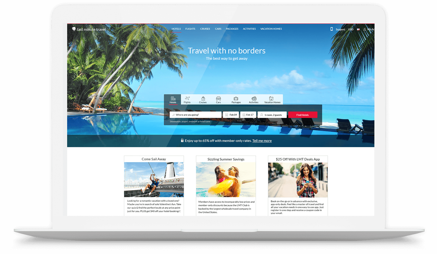
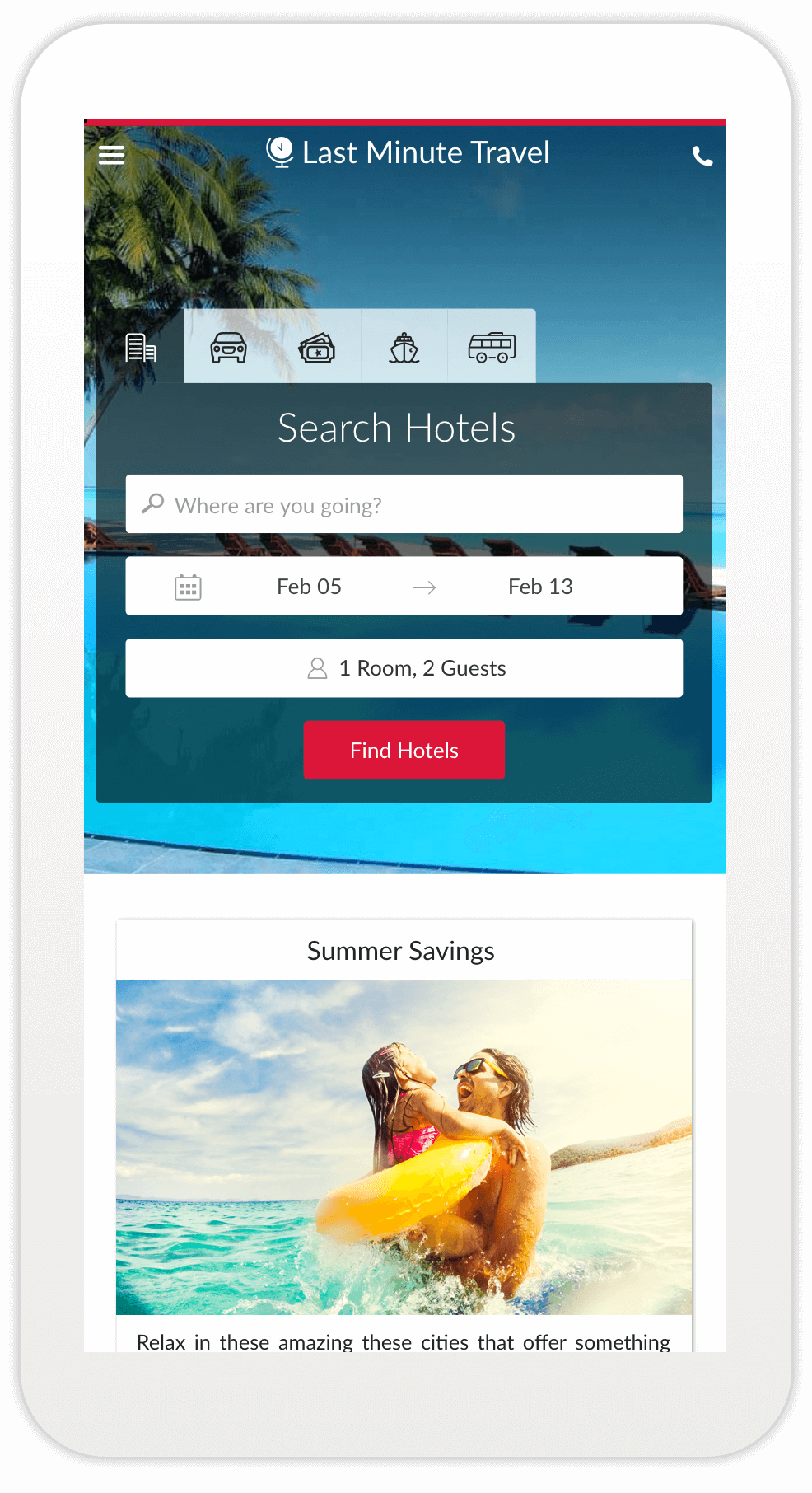
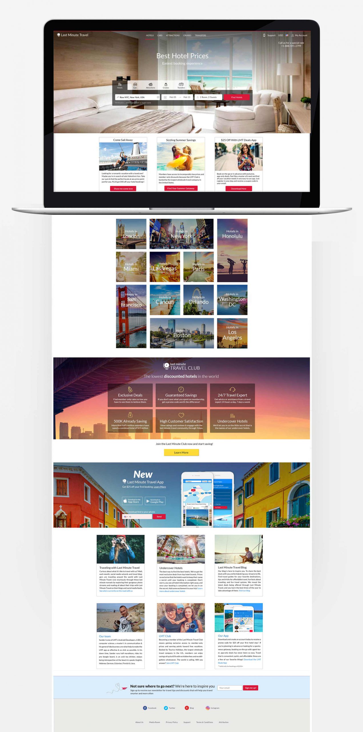
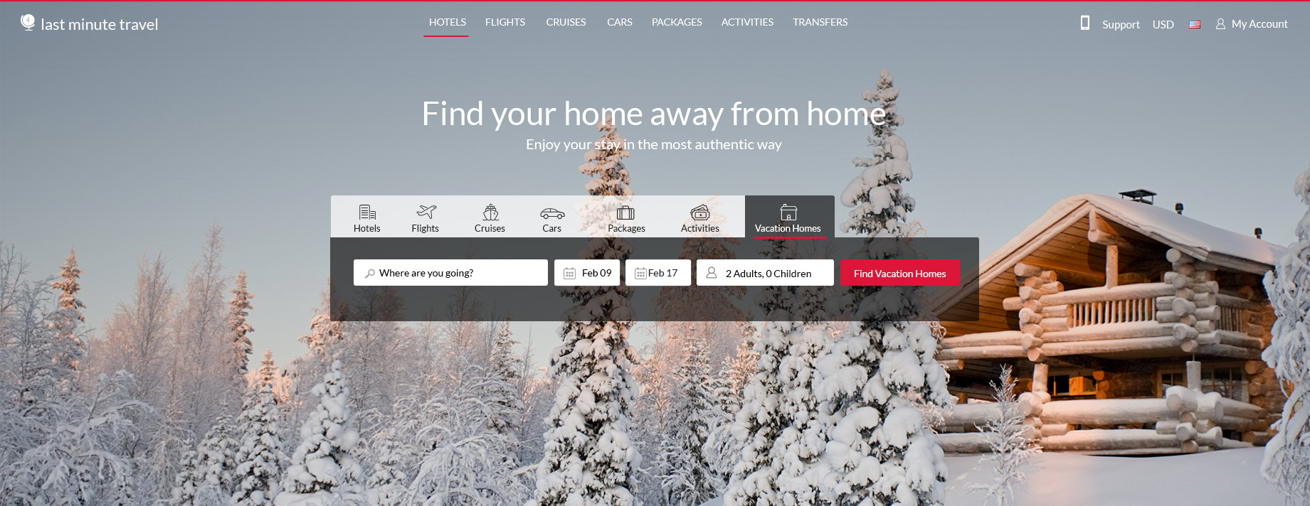
HOMEPAGE
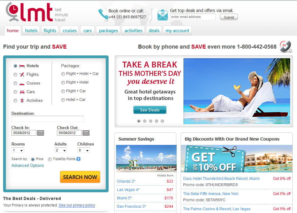
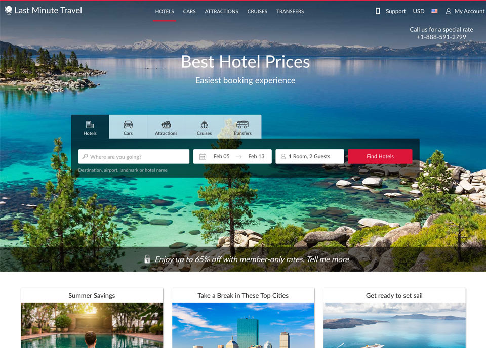
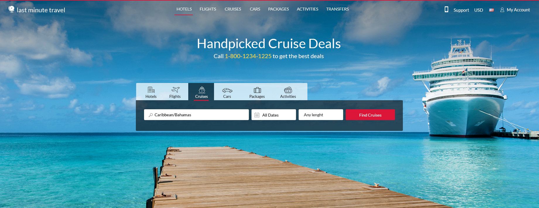
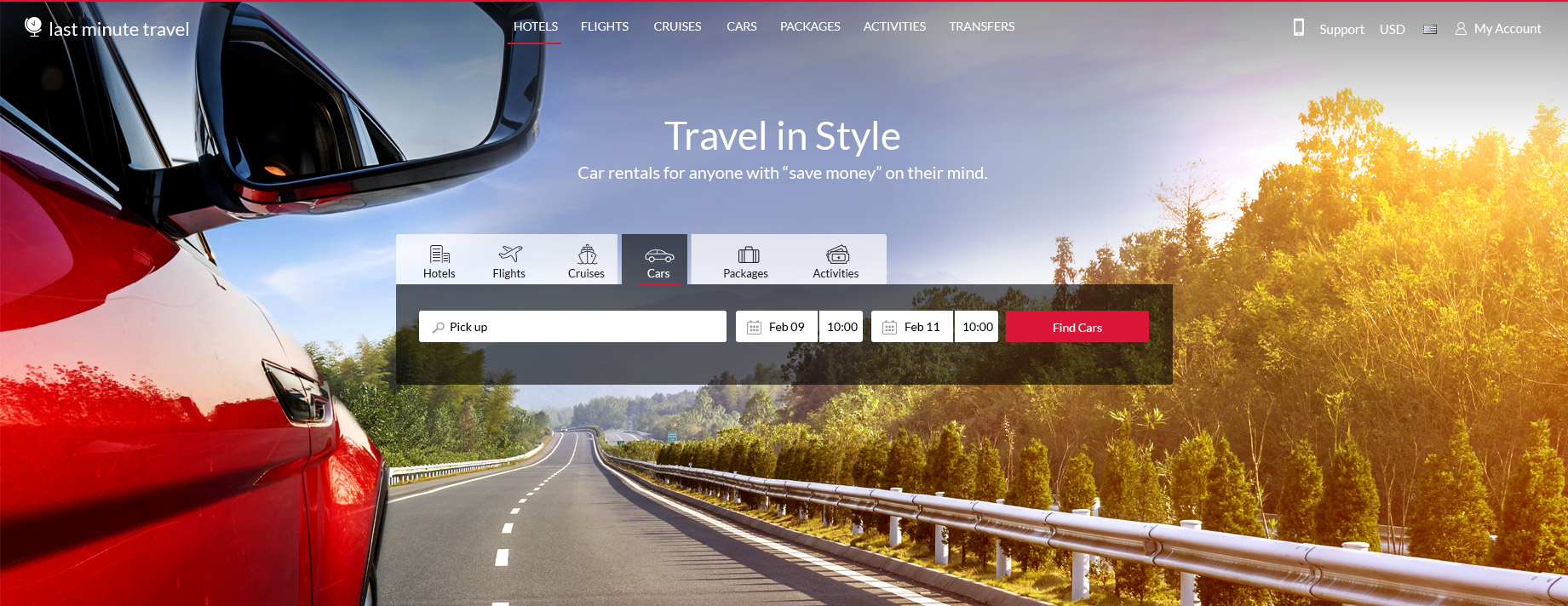
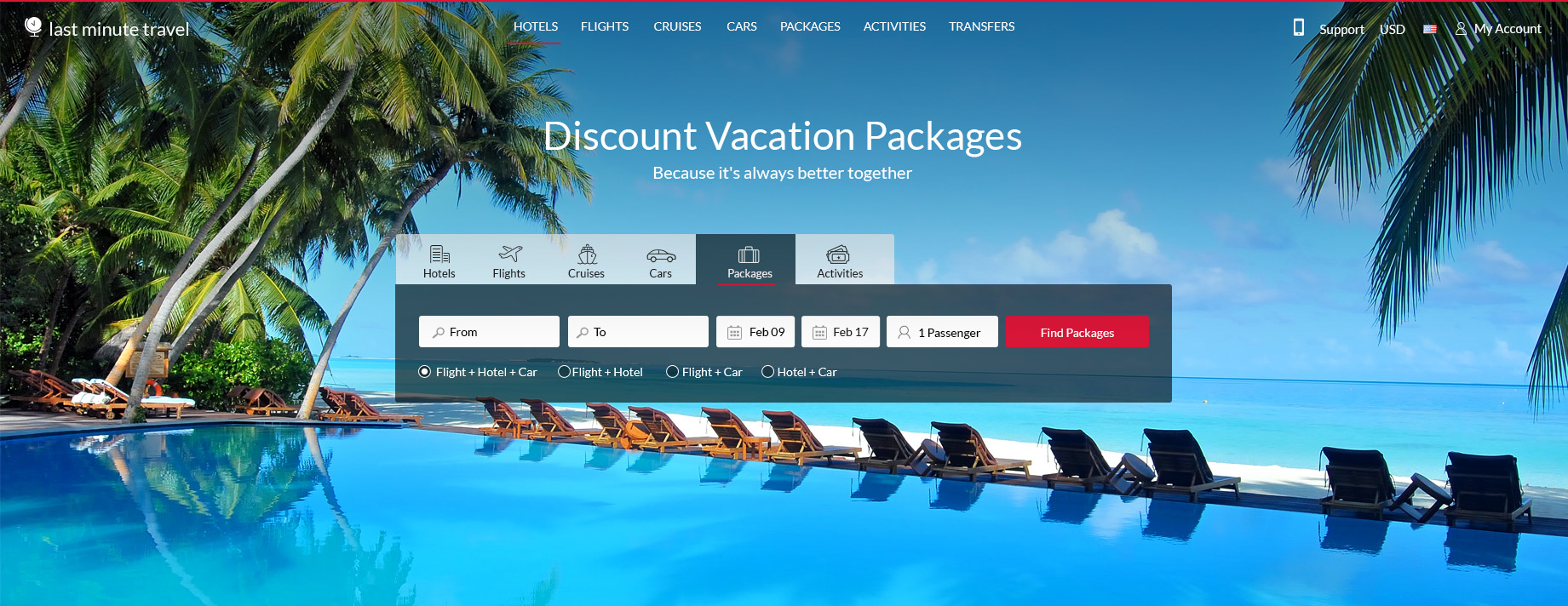
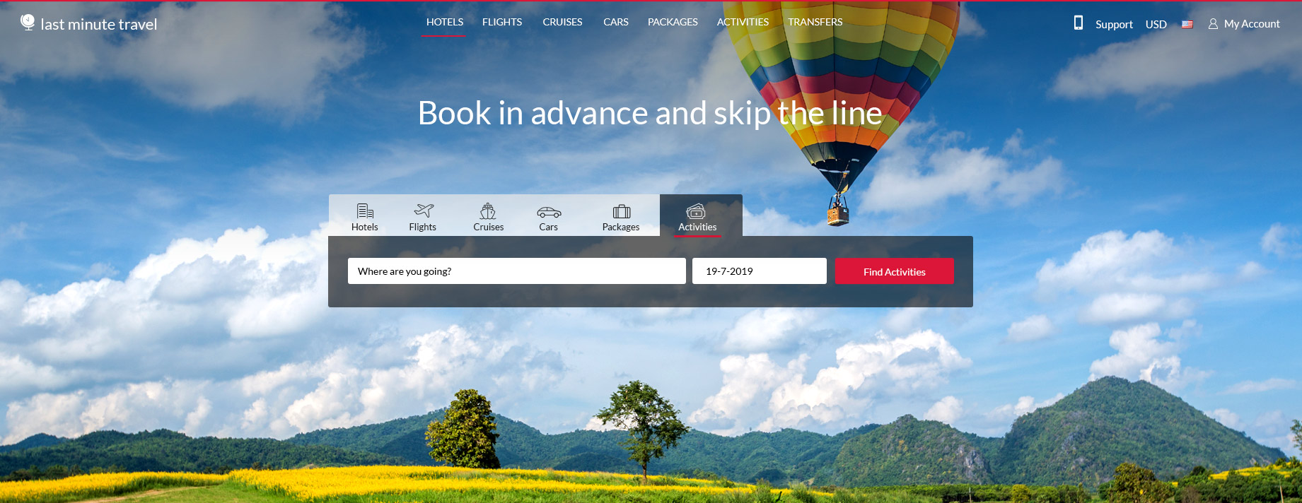
The homepage design was changed from small components to a large hero banner with a main searchbar as the main focus of the site.
I worked with the marketing team on the content below the hero banner. The second focus of the homepage was the campaigns we had running in the site, so they took a main focus above the fold. Below that we added links to deals in the main destinations of the site.
Below the fold we added sections about the Club and mobile app pages. At the end of the page we added some sections with text about the website, the main purpose of this section was SEO.
Slide to see “Before and After”
A comparison to show how the homepage used to look
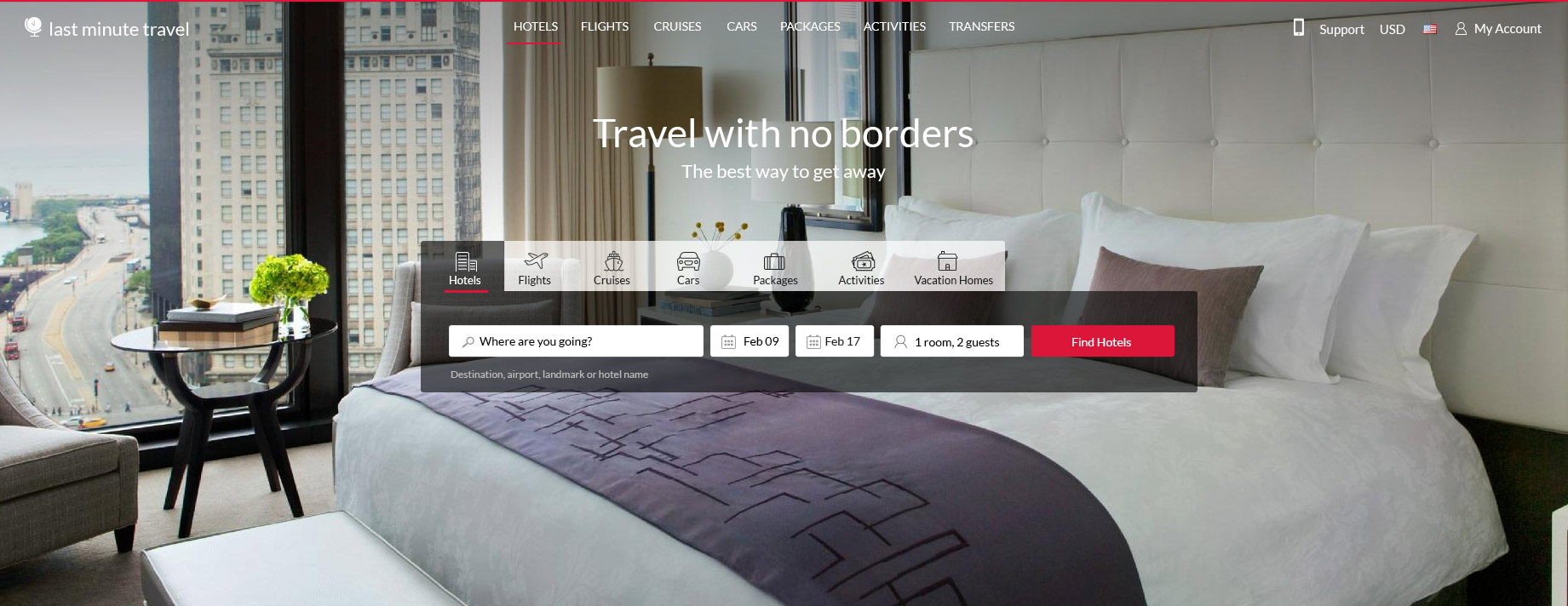
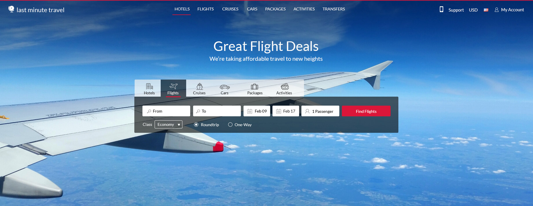
Product Tabs in Homepage
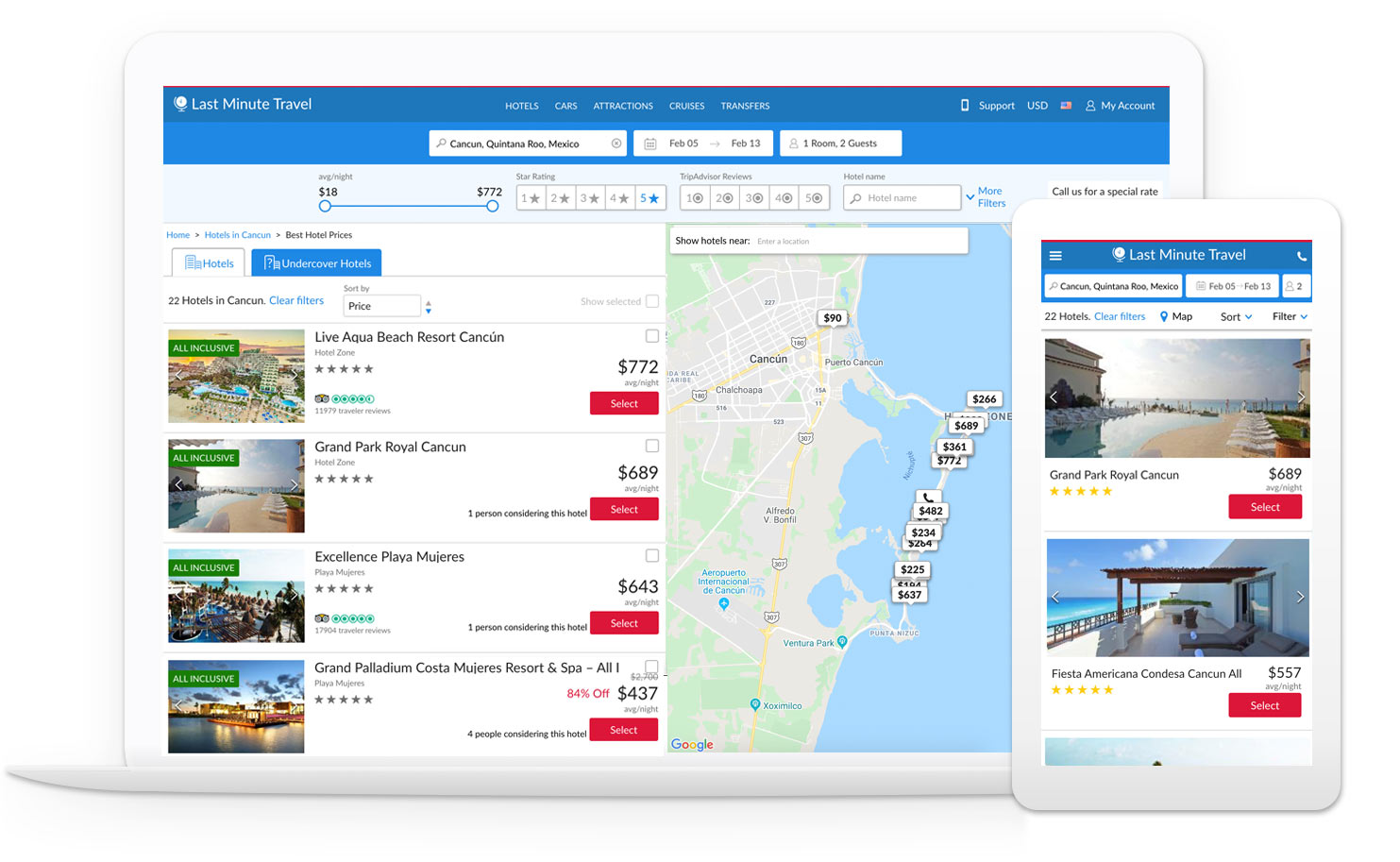
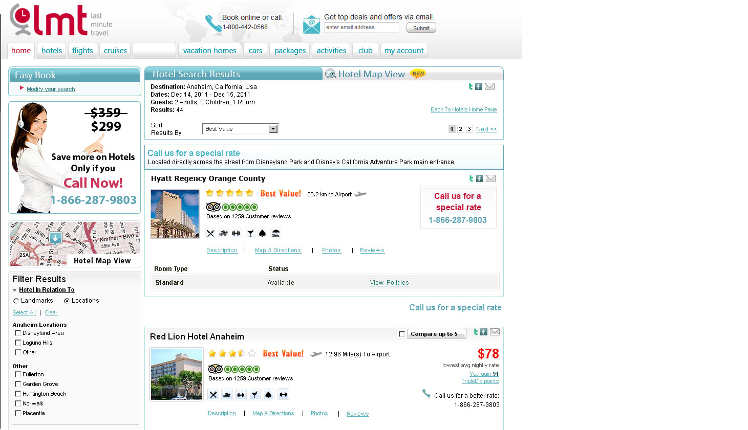
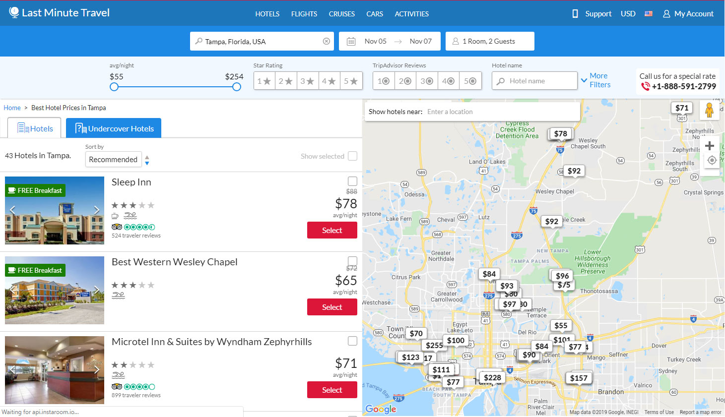
SEARCH RESULTS
The search results page design was outdated and non-responsive, we wanted to make a big change and interviewed many of the exisitng users of the site. One of the main results of this survey was that users wanted to see the hotels in a map, and search within the map for a certain location. We loved the challenge and designed a map focused page. Each “hover” on the hotels would highlight the hotel in the map. We also added a search feature inside the map, when searching for a specific location, the results sorting would change to the distance to that location. The conversion rate in this page jumped up after the redesign.
Slide to see “Before and After”
A comparison to show how the search results page used to look
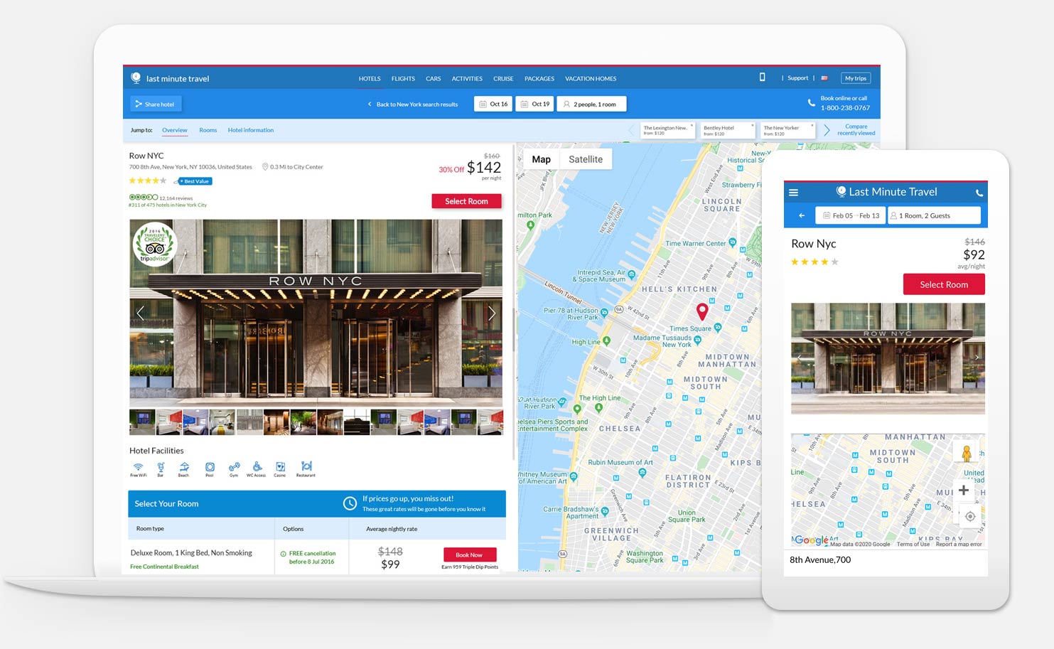
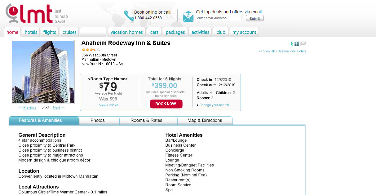
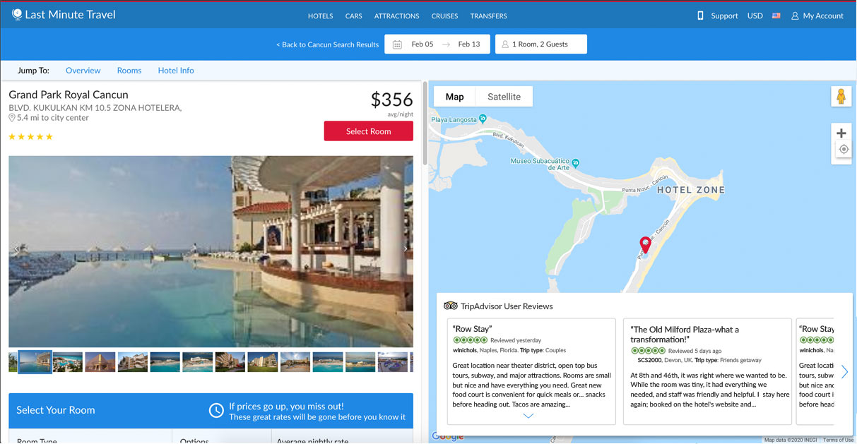
HOTEL DETAILS
The design concept in this page was having the map and Trip Adviser review on the right and the rest of the content scrolling on the left. We added large format images as the main focus on top of the fold and more information about the hotel.
Slide to see “Before and After”
A comparison to show how the hotel details page used to look
Brand Guidelines
Contact
dafnasu@gmail.com +972 054 2163228