WhaToDo
Activities App – Branding, UX and Design
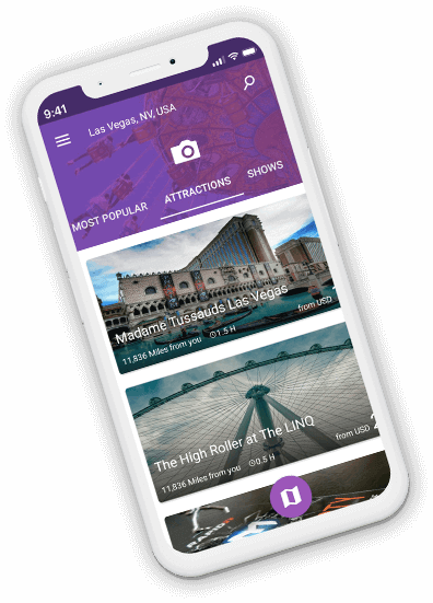
ATTRACTIONS.
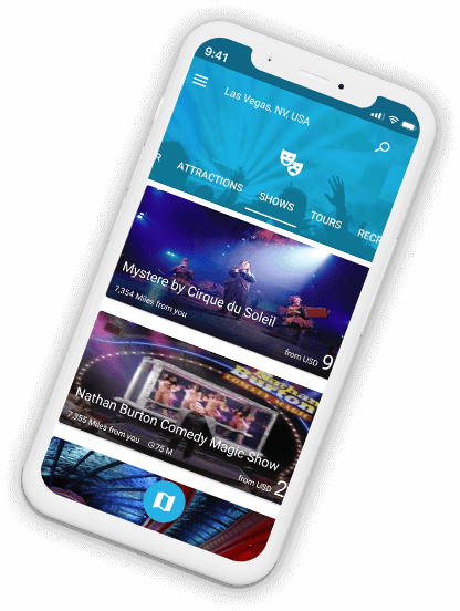
SHOWS
OVERVIEW
iPhone and android app that makes it easy to plan a trip in advance or find an activity on-the-go
DESIGN CONCEPT
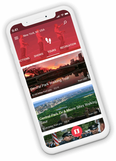
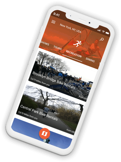
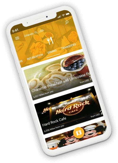
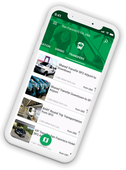
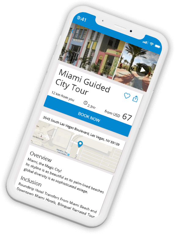
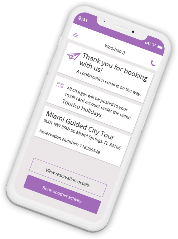
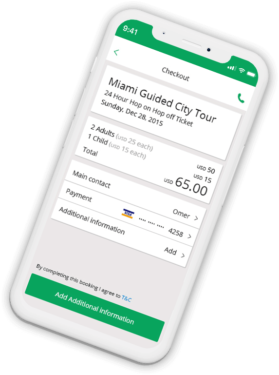
Activities are supposed to be fun, and that’s how we wanted the app to look. The main concept was COLORS. Each activity category had a color and after selecting an activity, the flow ahead had that specific color. So if the user would book a dinner, the whole flow would be yellow. While choosing a show, where the whole flow would be light blue.
TOURS.
RECREATION
MY ROLE
- UX UX research, user journey maps, scenarios and storyboards
- Prototyping Testing a demo app and improving it accordingly
- Branding and identity Logo, colors and typography design
- UI Design execution High fidelity final screens, assets and specifications for developers
- Validation Meeting with the developers to make sure everything looks pixel perfect
- Marketing materials Landing pages, app store assets, social media materials
DINING.
TRANSFERS
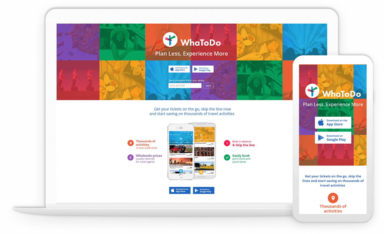
WHATODO LANDING PAGE
Contact
dafnasu@gmail.com +972 054 2163228